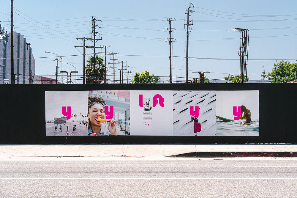
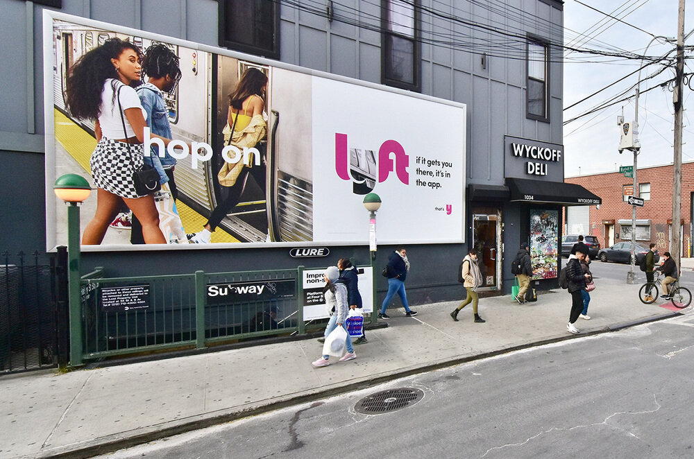
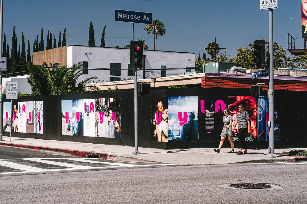
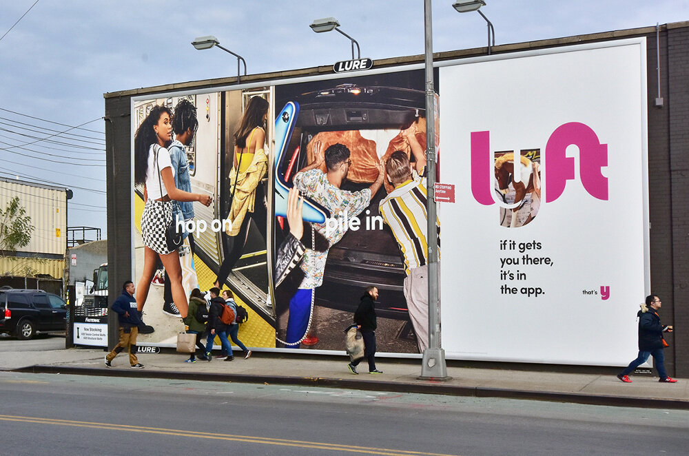
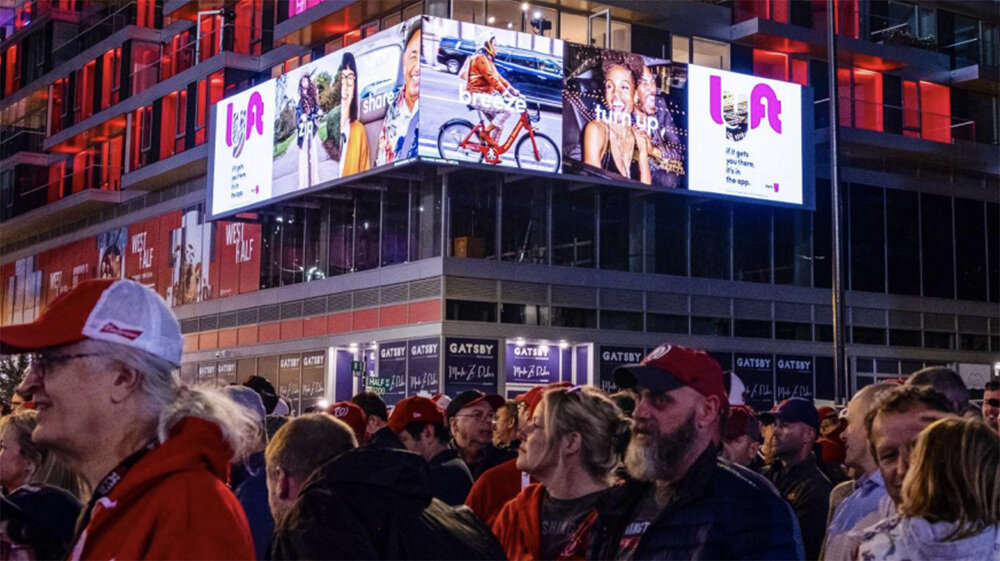
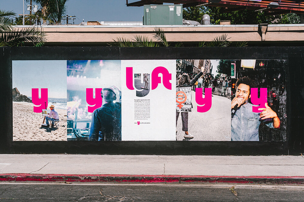
What started out as a campaign for Lyft's IPO day, quickly evolved to become the company's new brand identity. When Lyft decided to go public, we wanted the brand to reflect that transition as well. The company has grown and matured, and was no longer the scrappy start up it used to be. It was the perfect opportunity to move away from playful illustrations and eccentric iconography. Instead, we focused on what makes Lyft great: cities, and the people living in them. We decided to highlight all the things that make city living weird, poetic, grungy, exciting, and yeah, sometimes annoying. It's still the same quirky and fun brand, just a little bit more grown up.
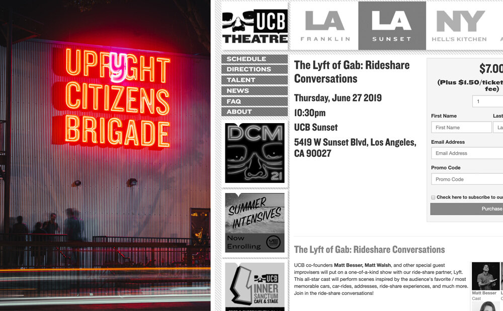
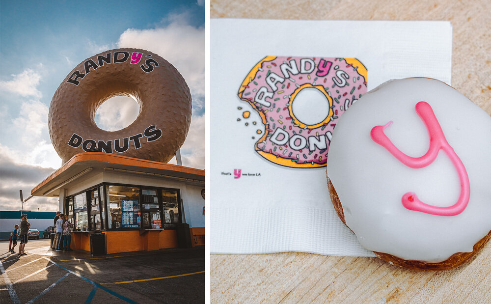
To embody the change, we singled out the Y in Lyft. To us, it represented the quirk in the brand. The "spelling mistake". As we rolled out the campaign to other markets, we continued to evolve and tinker the new brand identity.


For better or worse, 2019 has been dubbed as the year of tech unicorns - companies like Airbnb, Pinterest, Slack and Uber were all planning to go public around the same time. For Lyft, the first company in that group to go public, it was a rare opportunity to show the world how a (newly minted) public company can still be invested in the public good. All eyes were on us during IPO day, and how we communicated the company's mission and vision were critical.
Taking a company public was a huge undertaking, and required a kick ass cross-functional team. From legal and finance, to product and marketing, everyone pitched in to make this day a success.
